03Case study
Digitalni unuk
Patient help with phones, computers and online services — a service concept
- Status
- Concept / Prototype
- Role
- Concept, product thinking, UX direction, prototype development
- Stack
- Next.js, React, TypeScript, Tailwind CSS, Motion
One question, until it's understandable
The panes on the right are real questions from Digitalni unuk, a service concept for patient help with phones, computers and online services. Its red thread, the site's own visual idea, runs through them. One question is followed until it makes sense.
Skip the walkthrough0106
Many questions
The concept starts from everyday situations: messages, photos, video calls, email, phone settings, smart TV, online booking, apps and safety online. The site puts the difficulty where it belongs: “Nije problem u vama” (the problem isn't you).
- 9 situations
- 1 thread
- Viber i WhatsApp
- Fotografije
- Video pozivi
- E-pošta
- Podešavanja telefona
- Pametni TV
- Zakazivanje preko interneta
- Aplikacije
- Bezbednost na internetu
The prototype's nine everyday situations. 0206
One question
Take one: “Stigla mi je ova poruka. Da li je prevara?” (I got this message. Is it a scam?). It is one of the questions the site opens with, and one of its nine situations. The others aren't wrong; they simply wait their turn.
- 1 question in focus
- Viber i WhatsApp
- Fotografije
- Video pozivi
- E-pošta
- Podešavanja telefona
- Pametni TV
- Zakazivanje preko interneta
- Aplikacije
- Bezbednost na internetu
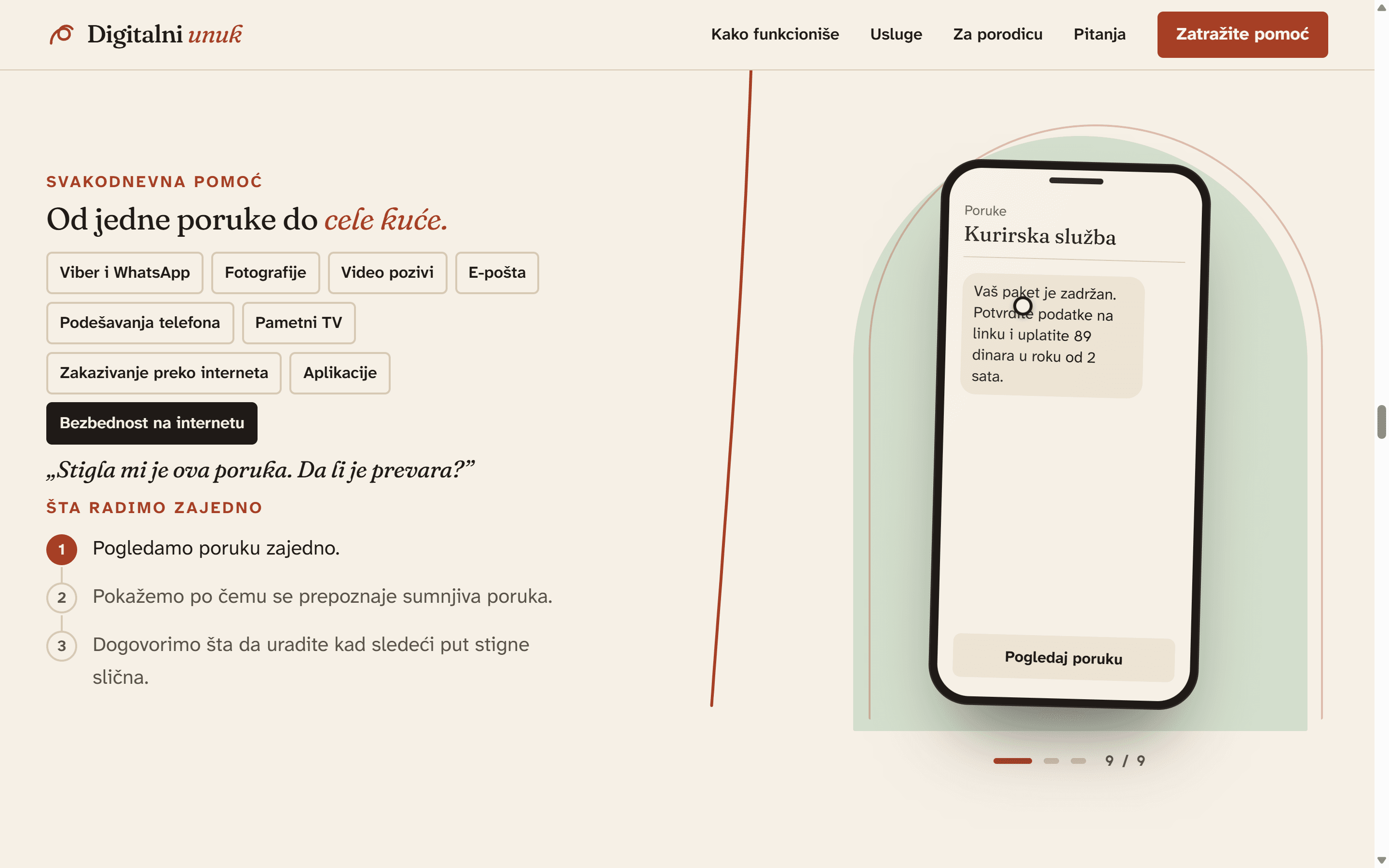
„Stigla mi je ova poruka. Da li je prevara?”
One question comes forward; the others wait their turn. 0306
Three steps
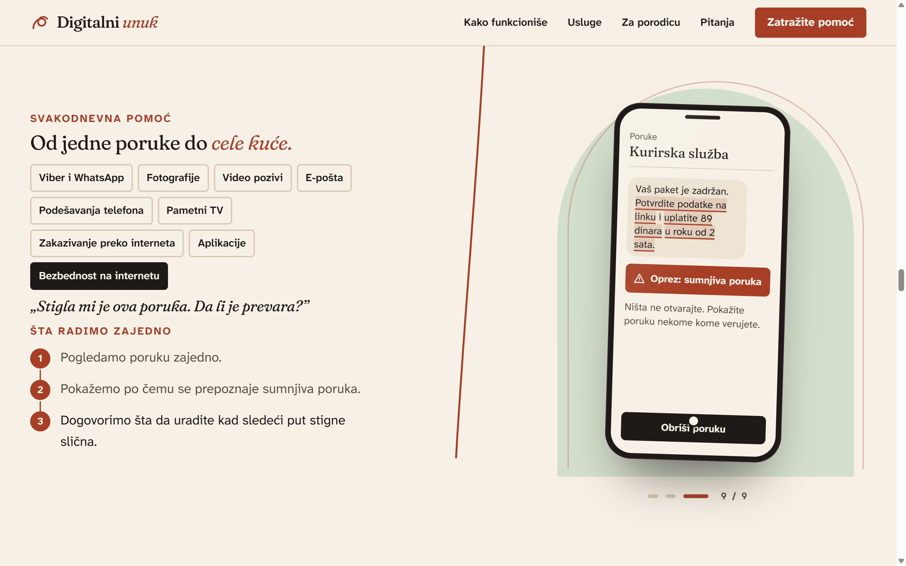
Its help comes as three steps: look at the message together, see how a suspicious message gives itself away, agree what to do when a similar one arrives. The site's stance is “Objašnjavamo. Ne preuzimamo.” (We explain. We don't take over.)
- step 1 → 2 → 3
„Stigla mi je ova poruka. Da li je prevara?”
- Pogledamo poruku zajedno.
- Pokažemo po čemu se prepoznaje sumnjiva poruka.
- Dogovorimo šta da uradite kad sledeći put stigne slična.
Three steps, one at a time. 0406
Three signs
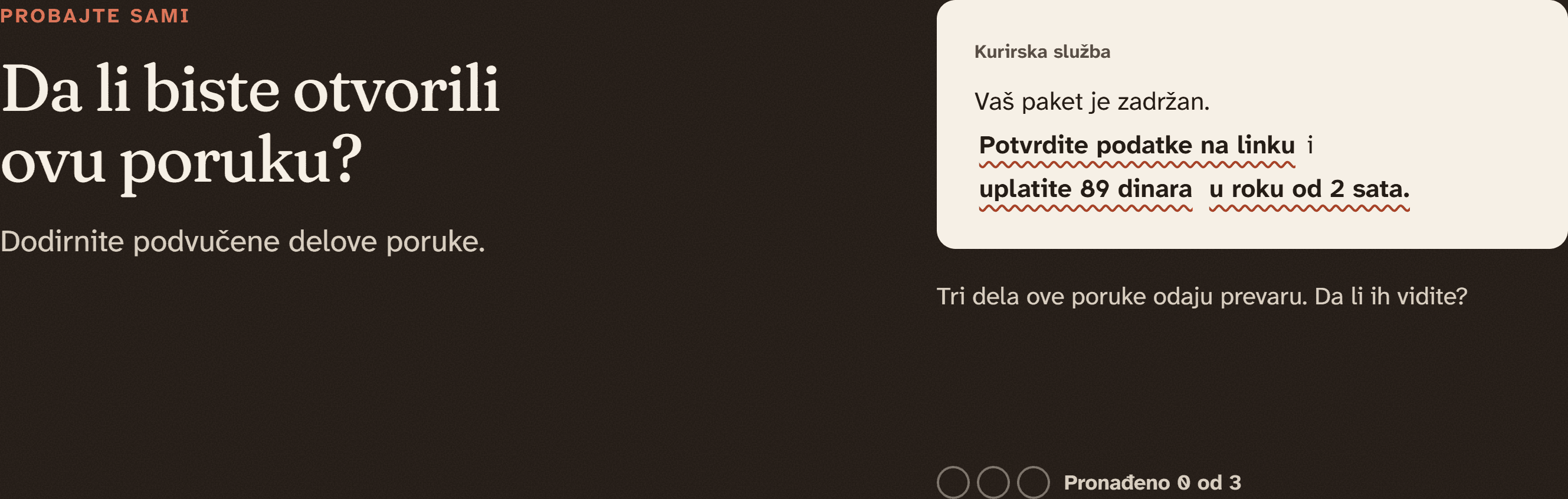
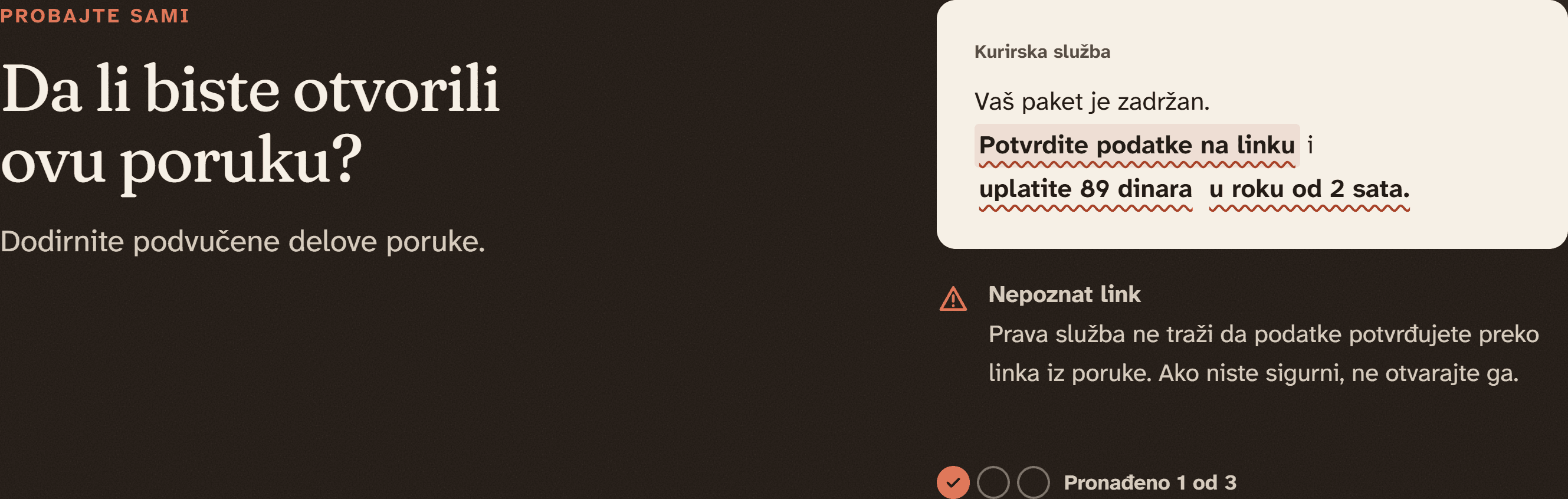
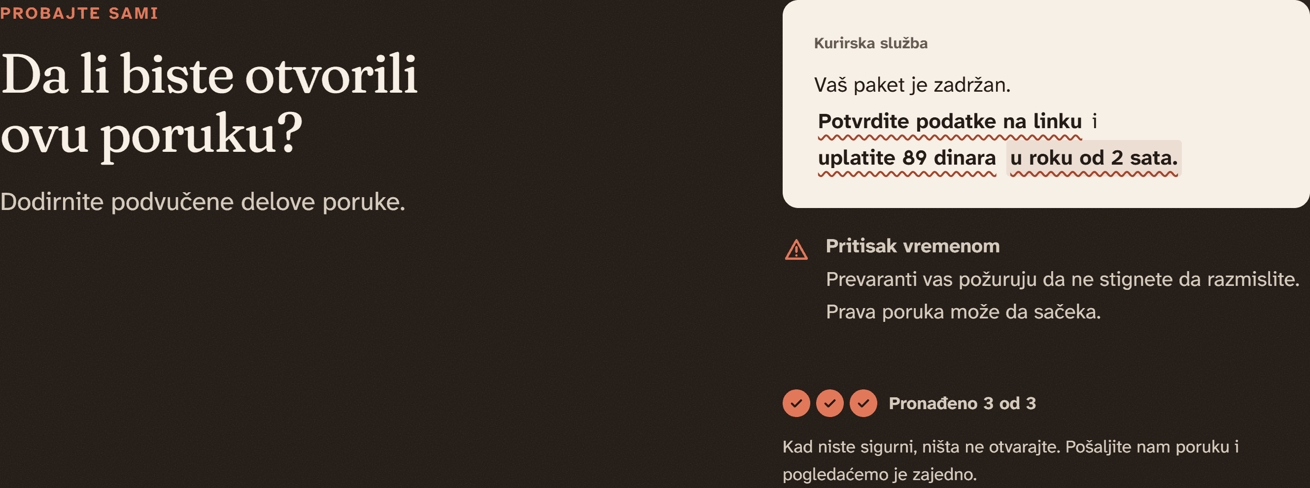
The site's scam check shows one fixed message and asks the visitor to tap what gives it away: an unknown link, a request for money up front, a two-hour deadline. Each find is explained and counted; after all three the advice is simple: when you're not sure, don't open anything. It's a fixed example, not an automatic check.
- Pronađeno 1 od 3
- 2 od 3
- 3 od 3 → advice
Kurirska služba
Vaš paket je zadržan. Potvrdite podatke na linku i uplatite 89 dinara u roku od 2 sata.
Pronađeno 3 od 3
Kad niste sigurni, ništa ne otvarajte.
The fixed example: three signs, then the advice. 0506
A short request
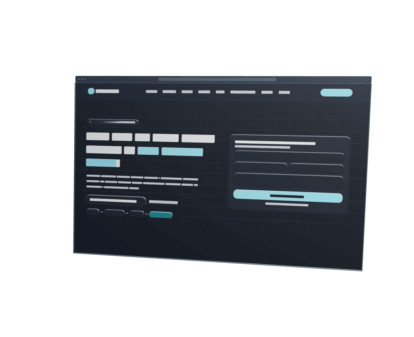
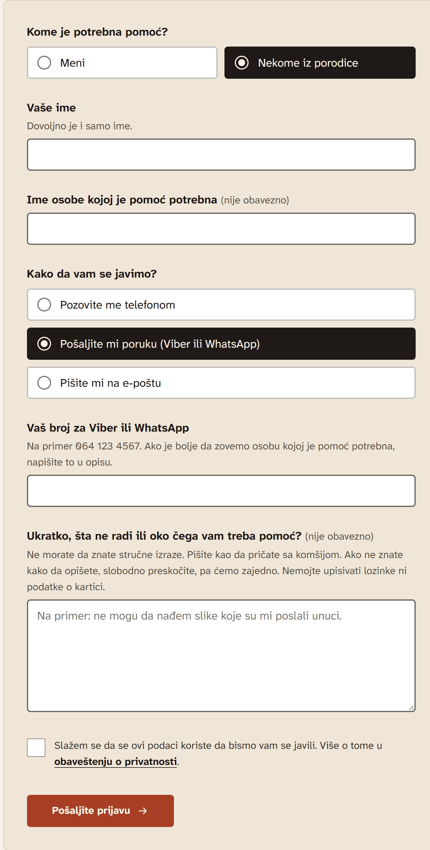
If more help is needed, asking for it takes a few calm choices: who it's for (the family option adds one optional name), a name, one way to get in touch (and only that method's field appears), and an optional description in everyday words. The form never asks for passwords, PINs or card details.
- 2 choices → 1
- 3 methods → 1
- 1 field
Kome je potrebna pomoć?
MeniNekome iz porodiceKako da vam se javimo?
Pozovite me telefonomPošaljite mi poruku (Viber ili WhatsApp)Pišite mi na e-poštuVaš broj za Viber ili WhatsAppUkratko, šta ne radi (nije obavezno)Two choices → one, three ways to get in touch → one, one field. The description stays optional. 0606
Understanding
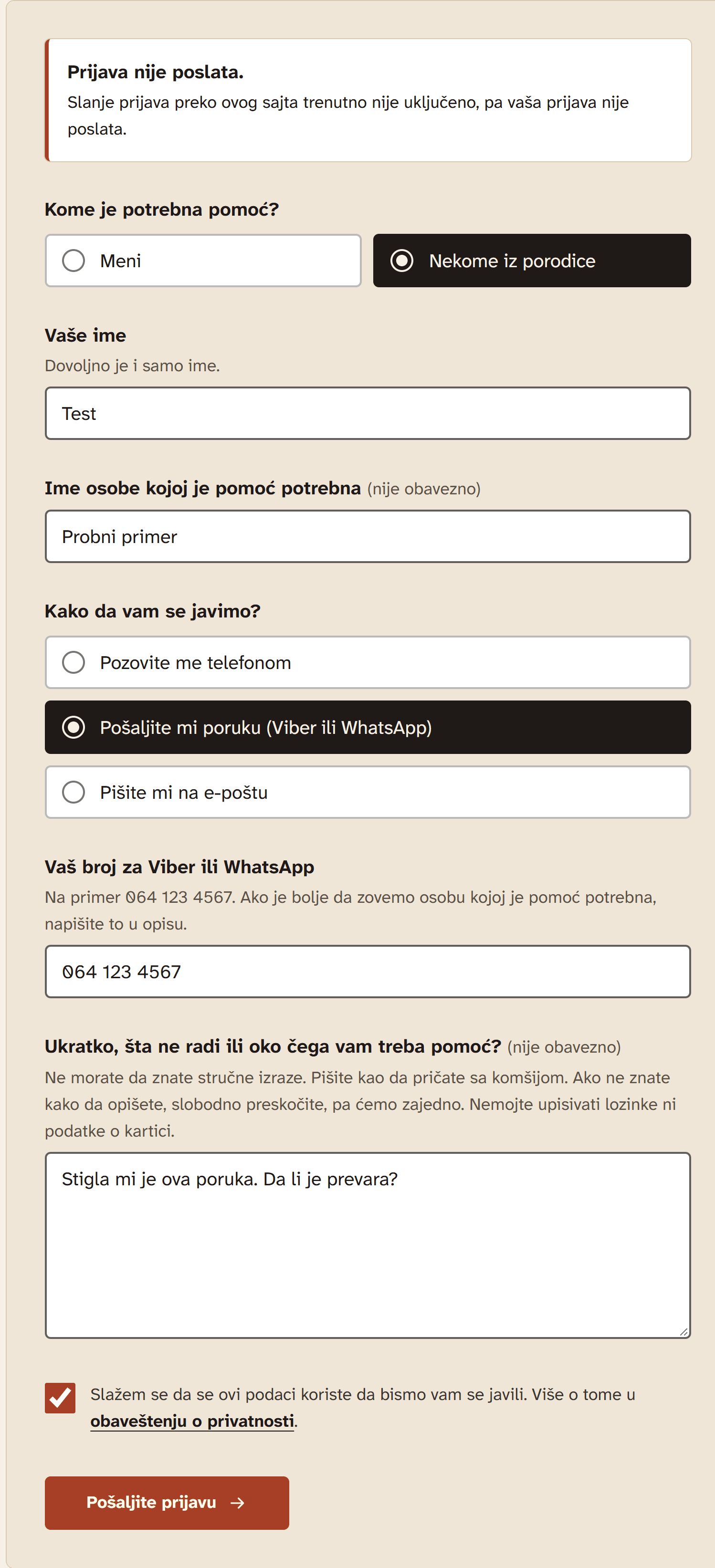
What remains is the point: knowing what to look for next time. If a request can't be sent, the form says so and keeps everything that was typed; it never shows a success it didn't have.
- advice
- one optional action
Email delivery is set up in the prototype but hasn't been verified end to end.
Kad niste sigurni, ništa ne otvarajte.
Zatražite pomoćWhat remains: the advice, and one optional action.
The prototype
Respect as a design rule
The difficulty is placed in the technology and the task, not in the person: the site's own lines are “Nije problem u vama” and “Objašnjavamo. Ne preuzimamo.”
One decision at a time: a situation, then one step; a form that reveals one contact field only after one method is chosen; an optional description that may be skipped.
Readable by default: body text in Atkinson Hyperlegible Next at about 18–21 px, headings in Fraunces, inputs and choices 56 px tall, and a visible focus outline everywhere.
It speaks to two audiences without talking over either: family members get their own section and can send a request on someone's behalf, while the person stays at the centre.
Honest by design
Business facts that don't exist yet (contact details, service area, prices, testimonials) are left empty and render nothing, instead of plausible-looking placeholders.
The request form never reports success when nothing was sent. Without email settings the server answers “not configured”, the page says so in plain words, and every field keeps what was typed.
The scam check is presented as what it is: one fixed example to practise on, not a service that analyses messages.
Architecture
01
Request form
client
- same validation as the server
02
Shared validation
one module, client + server
03
API route
POST /api/prijava
- content type + origin
- body size limit
- honeypot field
- per-address + global limits
04
Delivery
Resend, over fetch
- set up, not verified end to end
05
Inbox
one message per request
Implementation
Next.js 16 (App Router), React 19, TypeScript, Tailwind CSS v4 and Motion.
One validation module is shared by the form and the server; the prototype's 26 tests cover validation, contact links and the email format, and all pass.
The request endpoint checks content type and origin, caps the body at 10 KB, ignores a hidden honeypot field, and limits sending per address and overall, so the email quota can't be exhausted. The limits are kept in memory, a documented trade-off for a single instance.
Security headers and a frame and form-action policy are set in the Next.js config.
Reduced motion is handled in CSS rather than by branching the rendered output, which avoids hydration mismatches; pinned scenes run only on large screens with motion allowed, and everywhere else the same content is a static, readable layout.
Current state / Next iteration
Current state
A service concept with a complete Serbian-language prototype site: the landing story, the everyday scene, the scam check, the services page and the request form.
In progressNot publicly launched; there is no public address yet.
In progressEmail delivery is set up but hasn't been verified end to end.
In progressContact details, service area and prices are intentionally empty, and the legal pages are marked as not yet reviewed.
In progressNot yet tested with the people it's meant for.