02Case study
Studio Sajtova
Web design & development service for local businesses
- Status
- Live
- Role
- Founder · Product, design direction & implementation
- Stack
- TanStack Start, React, Vite, Tailwind CSS, Web3Forms, Cloudflare
- Links
- studiosajtova.com
One first screen, taken apart and put back together
The panes on the right are the first screen of studiosajtova.com, measured from the live page at 1440, 768 and 390 px wide. They're taken apart to show what the screen is built on, put back together, then reflowed the way the live page reflows. It's a reconstruction of the interface, not a record of how it was designed.
Skip the walkthrough0107
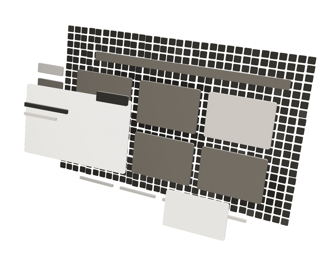
Taken apart: the constraints
Lifted off the page, the screen shows what it sits on: the browser window, a content column inside a 1,280 px container with 16 px padding, and a hero split 1.1 : 0.9 between the pitch and a form, 40 px apart, under an 85 px header.
- container 1280 px · padding 16 px
- grid 1.1fr / 0.9fr · gap 40 px
- header 85 px
The window, the container's content edges, the header and the hero's two columns; the elements as outlines. 0207
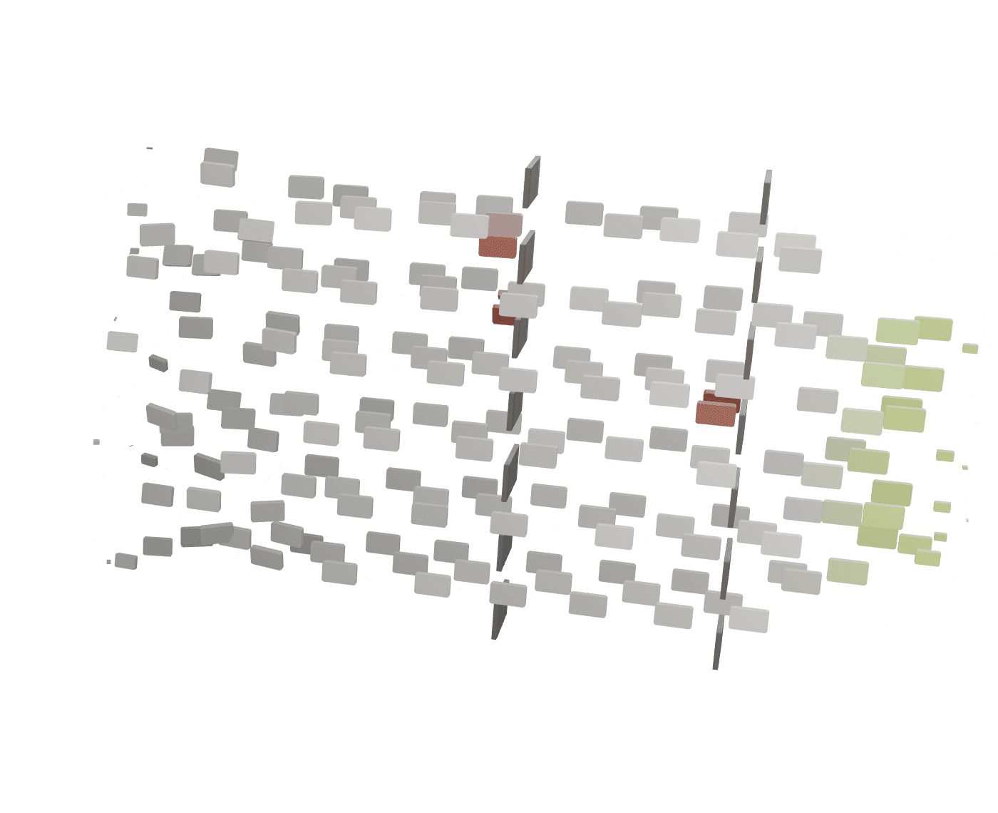
Hierarchy, made physical
The page's semantic roles become physical layers: the headline (the page's h1) and the form nearest, then the two actions, the supporting paragraph, the eyebrow and chips, and the navigation furthest back. The depth is an explanation of the page's hierarchy, not something the markup ranks.
- h1 · form
- actions · paragraph
- chips · nav
Semantic roles as layers, nearest to furthest back. 0307
The exact layout
Put back, every element lands on its measured position. The text column shares one left edge at the container's padding, the form card ends at the container's right edge, and the two columns are centred on the same axis.
- shared left edge
- card to the content edge
- items-center
Each element on its measured position. 0407
The visual system, by role
The live system goes on in layers: a navy page with a faint 56 px grid; Space Grotesk for the headline and Inter for body text; the cyan gradient kept for the key words and the actions; glass cards, fields and chips with thin white borders; and the shapes: 22 px cards, 18 px fields and buttons, pill-shaped chips.
- surface → type → accent → components → shape
Surface, type, accent, components and shape, applied by role. 0507
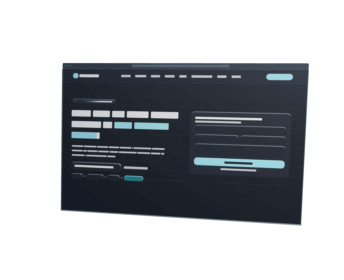
Back together
Reassembled, it's the live first screen of studiosajtova.com: TanStack Start and React on Vite, styled with Tailwind CSS and served through Cloudflare. The hero form sends through Web3Forms.
- TanStack Start · React · Vite
- Tailwind CSS
- Web3Forms · Cloudflare
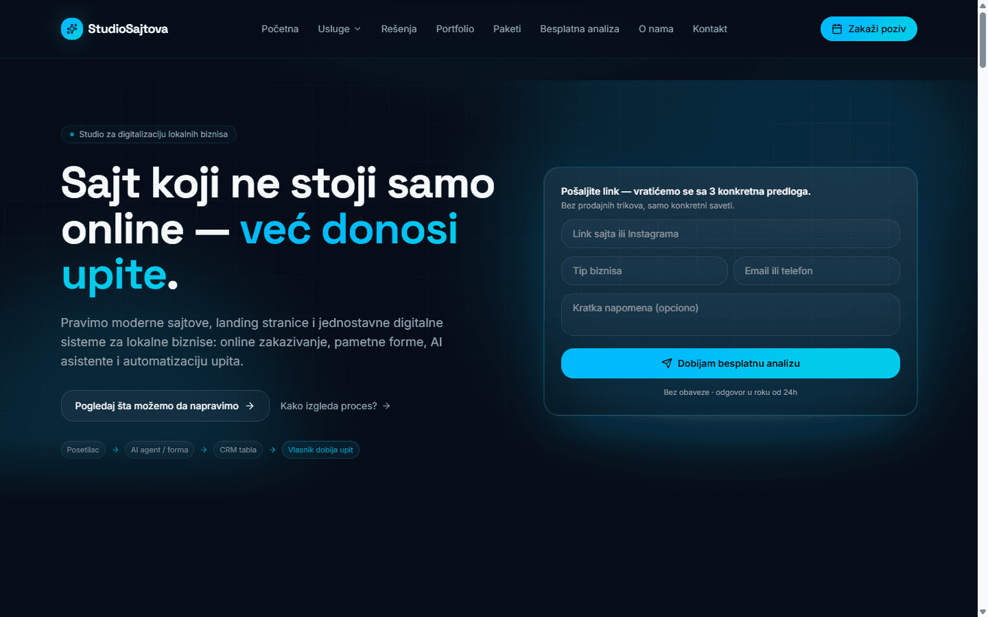
LiveThe reassembled screen: the live studiosajtova.com first screen at 1440 px. 0607
Reflow: 1440 → 768
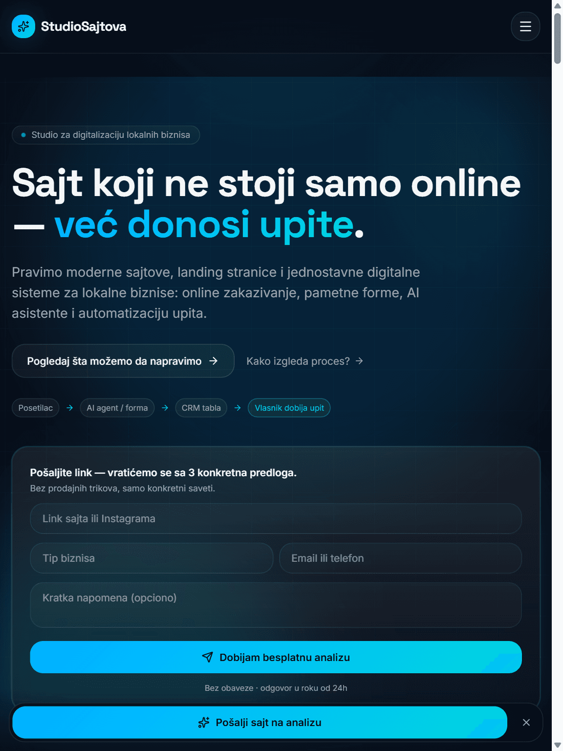
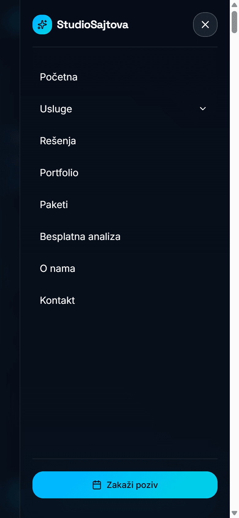
Below 1024 px the same page changes structure rather than shrinking. The navigation and the call button move into a menu button, the hero becomes one column with the form beneath the text, the headline rewraps from three lines to two, and a fixed bar keeps the analysis action on screen.
- 1024 px: 2 columns → 1
- nav → menu
- + fixed bar
768 px: a menu button instead of the navigation, the form beneath the text, a fixed bar at the bottom.
The same page, 1440 → 768 px, at one pixel scale. 0707
Reflow: 768 → 390
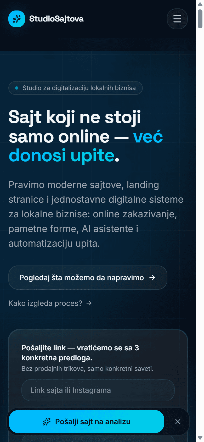
At phone width the headline rewraps to three lines and the paragraph to five, the two actions stack, the flow chips are hidden and the form's fields go to one column. The form now starts near the bottom of the screen, and the fixed bar keeps the analysis action within reach.
- h1 64 → 53.8 → 35.2 px
- actions stacked · chips hidden
- fields: 1 column
390 px: the headline on three lines, stacked actions, no chips, one-column form fields.
Narrowed again to 390 px. Pick a width to compare.
The live page
Offer & positioning
Studio Sajtova presents itself as a studio for digitalising local businesses: a site that doesn't just sit online but brings in inquiries.
Services offered: websites and landing pages, online booking, a smart inquiry form, an inquiry CRM, AI agents, automation and local SEO.
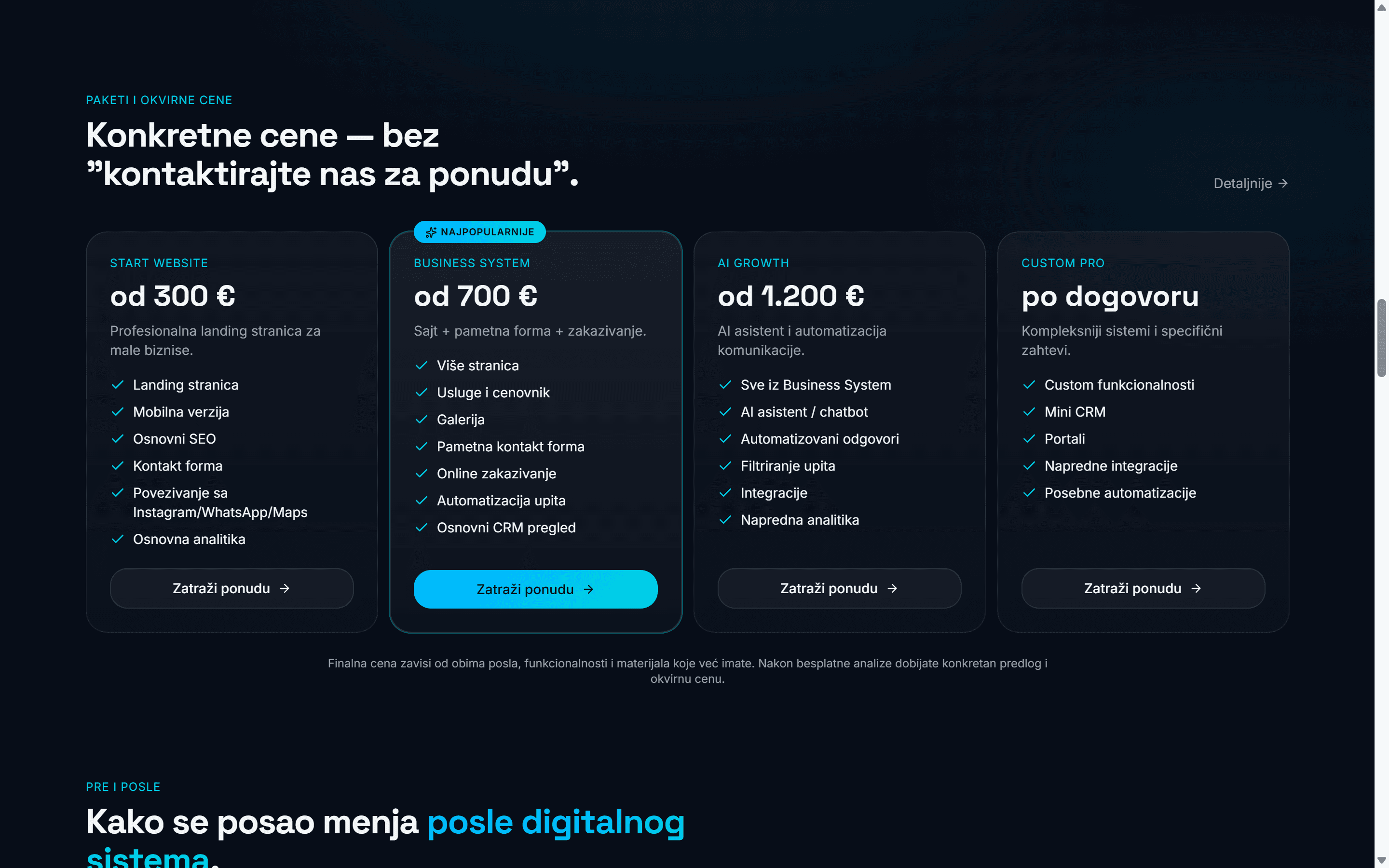
Packages publish starting prices, from a starter website to custom work.
The site publishes its own seven-step process, from an analysis of the business to launch and support.
The first step is a free analysis: the hero form asks for a link to a site or Instagram profile.
Demonstrations & concepts
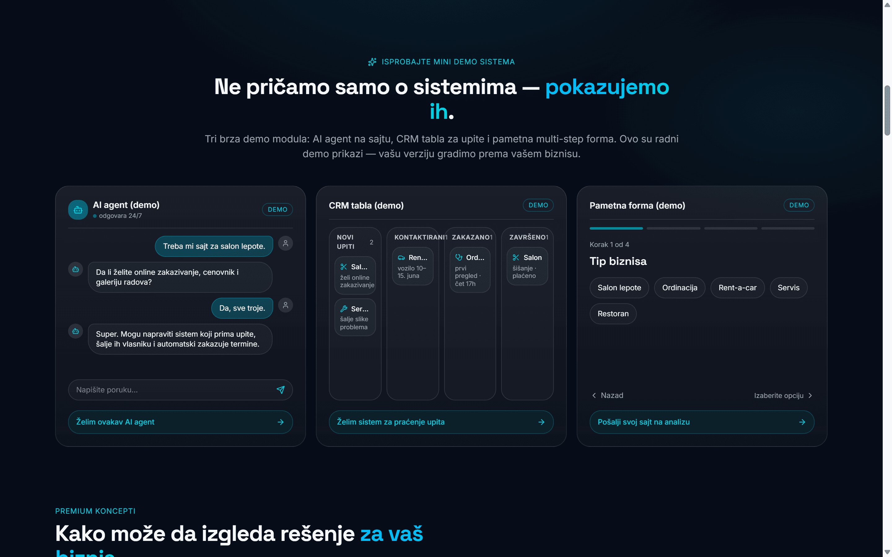
Interactive demonstrations show what's offered instead of describing it: a scripted AI chat, a static inquiry board and a smart form that steps through in the browser, each labelled as a demo.
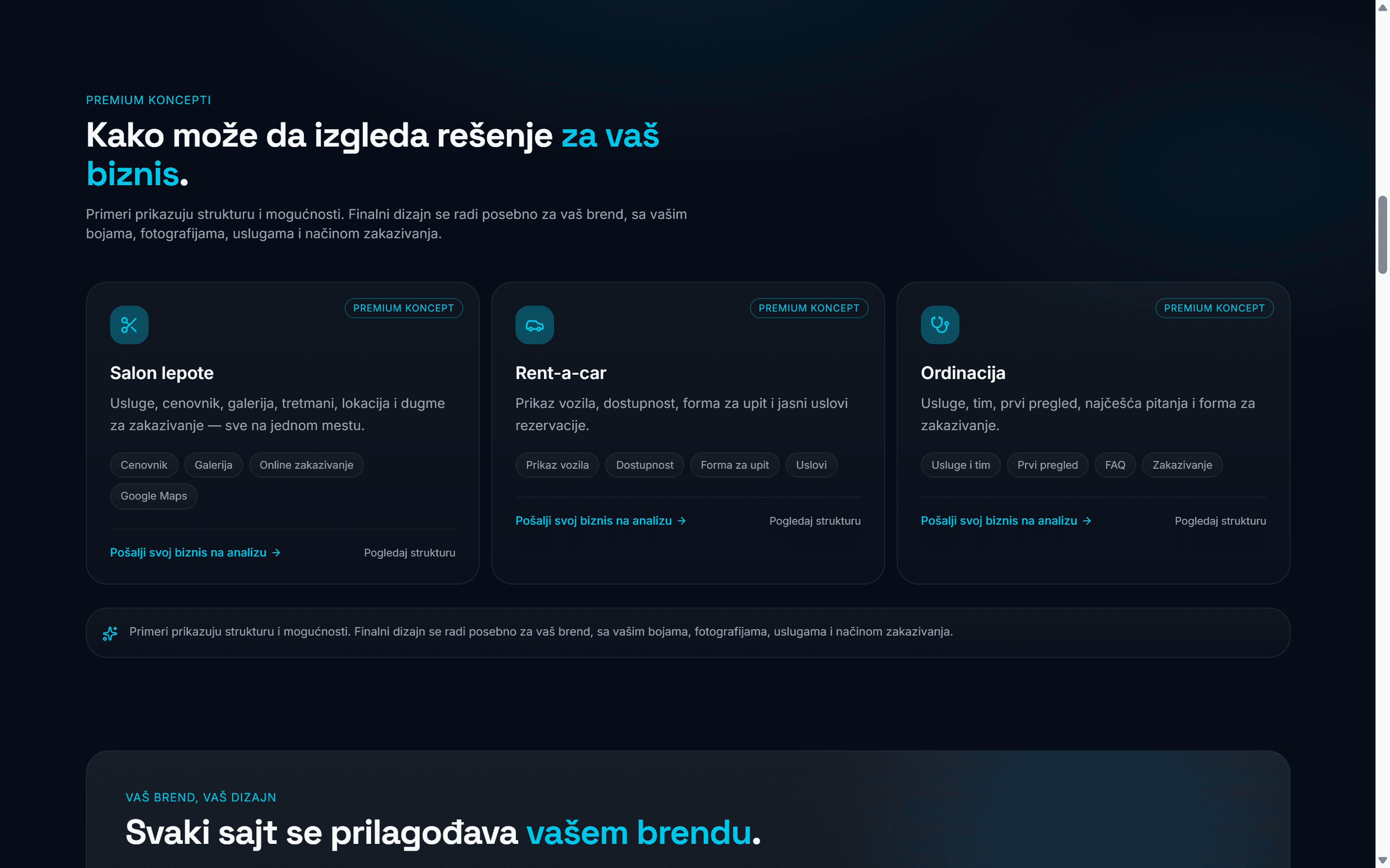
Industry concepts (a beauty salon, a rent-a-car, a medical practice) are presented as concepts, and the demo pages say their forms don't send anything.
Visual system
One visual language across the site: a navy page, Space Grotesk headings over Inter body text, a cyan gradient reserved for actions and key words, and glass cards and pills with thin white borders.
Colour
- Page#070d18
- Text#f2f6f8
- Muted#9ca5b1
- Actions & key words, 135°#00afff → #00d1da
Type
- Space Grotesk · Headline700 · 64 / 53.8 / 35.2 px
- Inter · Body400 · 18 px
Radius
- Card · 22 px
- Field · button · 18 px
- Chips · pills · pill
Implementation
Built with TanStack Start and React on Vite, styled with Tailwind CSS, and served through Cloudflare.
The site's forms (the hero, the contact page, the free-analysis page) send through Web3Forms.
Responsive at Tailwind's breakpoints: two columns and full navigation from 1024 px, one column and a menu button below.
Current state / Next iteration
Current state
Live at studiosajtova.com.
The examples on the site are demonstrations and concepts; no client work is shown yet.